
NYC Cyclist Collisions
For this project, I sifted through eight years of NYC Open Data project datasets on recorded bike collisions to create an interactive heat map of the most dangerous intersections in New York City and highlight the top contributing factors to collisions.

It’s no secret that
biking in New York City means regularly flirting with disaster. After a near miss with an inattentive driver on my own morning commute, I became personally invested in researching the prevalence of cycling-related collisions in the city. I saw this problem as an opportunity to apply my analytical skills to potentially improve cyclists’ lives.
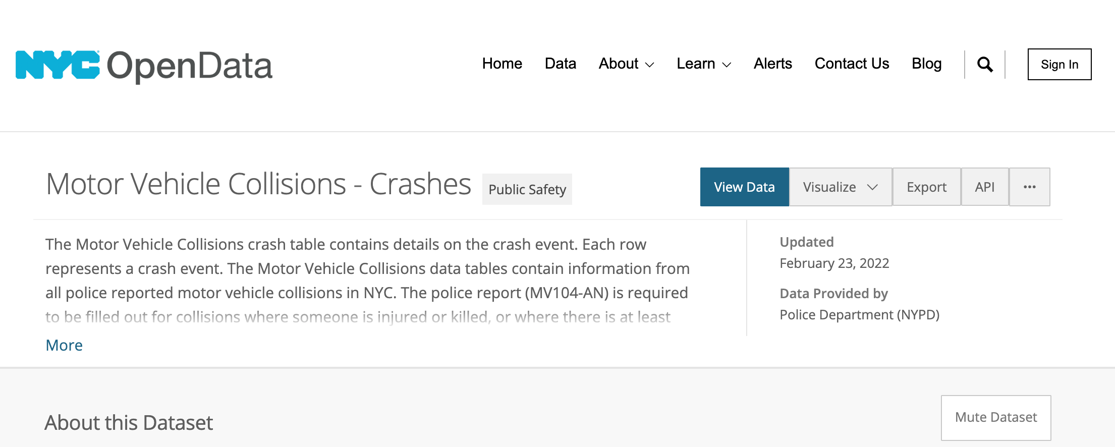
Above: a screenshot of NYC Open Data’s dataset. There are many other datasets available for investigation too.
Step 1: Acquire the data
The first step was to figure out where I could acquire the data. Fortunately, the City of New York maintains raw data in CSV format from city agencies via the NYC Open Data project. I downloaded all motor vehicle collision reports filed by the NYPD in the last eight years.
Step 2: Clean it up
I then opened up trusty R to first explore the data, clean up the typos that inevitably crop up from manual data entry (e.g. “court” vs “cort”), and reshape the data into a Tableau-friendly format. I then filtered the data down to only collisions involving cyclists.
Step 3: Explore the data
Once satisfied with my cleanup job, I imported my data set into Tableau and began to search for strong visual patterns and correlations between selected factors. The grim picture that emerged was impossible to ignore: cyclist deaths were indeed on the rise, and nearly three-quarters of reported collisions resulted in injury.
Step 4: Tell the story
I knew I needed to present my findings in a way that would convey urgency yet professionalism. So, I assembled an interactive report that focused on:
annual injury and fatality rates,
top contributing factors to collisions,
an interactive heat map highlighting collision clusters, and
a visualization of the most incident-prone times of day and months of year.
The full visualization is available on Tableau Public to explore and can be accessed by clicking on the screenshot below.
